
On this page
Key takeaways
- Colour is the fastest thing a customer processes about your brand — it shapes recognition before a single word is read, and in India it carries cultural meaning most palettes ignore.
- There is no universal ‘trust blue’ or ‘luxury black’; meaning shifts by category, context and community — saffron, red and gold all read differently at a wedding than on a fintech app.
- A palette is a system, not a favourite colour: one primary, a couple of secondaries, neutrals and a single accent, governed by the 60-30-10 rule and built to survive screen and print.
- The most expensive colour mistake in India is the one nobody plans for — a brand that looks right on Instagram and prints wrong on the festive flex, because nobody set the CMYK and Pantone.
Most founders pick brand colours the way they pick a shirt — ‘I like this one.’ But colour is the first thing a customer decodes about you, faster than your name or your tagline, and in India every hue arrives pre-loaded with meaning. Here’s how colour psychology actually works for Indian brands: what our colours signal, which category rules to follow and which to break, and how to build a palette that converts on a phone screen and a wedding-season hoarding alike.
Does colour really affect how customers see a brand?
Yes — colour is the single fastest brand cue a customer processes, registering before they read your name or your offer. It drives recognition, sets an instant emotional read, and nudges behaviour at the point of decision. It won’t fix a weak product, but it decides the first impression you don’t get to make twice.
Think about how recognition actually works. A customer scrolling a feed or scanning a shelf isn’t reading — they’re pattern-matching at speed, and colour is the loudest pattern. Consistent colour is why you spot a brand from across a market before you can make out the logo. That recognition compounds: every consistent exposure makes the next one faster to register, which is exactly why a brand that keeps changing its colours never builds the reflex.
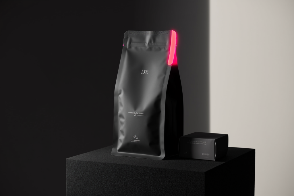
Colour also frames expectation before the rational brain catches up. The same skincare jar reads ‘clinical’ in clean whites and blues, ‘Ayurvedic’ in earthy greens and ochres, and ‘luxury’ in black and gold — identical product, three different customers and three different price ceilings. That’s the real business stake. Colour isn’t decoration sitting on top of the brand; it is part of the visual identity system that tells a customer who you’re for and what you’re worth, in the half-second before they decide whether to care.
What do colours mean in Indian culture?
In India, colour meaning is culturally loaded and often the opposite of Western convention. Red signals auspiciousness, marriage and energy, not just danger. Saffron carries spirituality and courage. Gold means prosperity and celebration. Green reads growth, nature and, for many, faith. White means purity — but also mourning, depending entirely on context.
This is where global colour advice quietly misleads Indian brands. A Western table will tell you white is ‘clean and minimal’ and red is ‘urgent, use sparingly.’ Walk into any Indian wedding and red is everywhere, joyfully — it’s the colour of the bride, of celebration, of good fortune. White, meanwhile, is the colour of purity in one frame and of condolence in another. Context decides. A white-dominant palette can feel premium and pure for a skincare or wellness brand, and entirely wrong for a festive sweets brand where the same white reads sombre.
The lesson isn’t to avoid these colours — it’s to use them knowingly. Saffron can be a powerful, rooted choice for a brand that wants to feel proudly Indian, spiritual or bold; it can also tip into political or religious association you didn’t intend. Gold lifts a brand toward premium and celebration, which is why jewellery, sweets and festive packaging lean on it — but overused, it cheapens fast. Read the room, the region and the occasion. Colour that lands beautifully in a Diwali campaign can read completely differently to the same audience in a different month.
| Colour | Common Indian associations | Works well for | Watch out for |
|---|---|---|---|
| Red | Auspicious, marriage, festive energy, passion, appetite | Weddings, food, festive offers, bold challengers | Can also read ‘alert/error’ in UI; tiring as a dominant tone |
| Saffron / Orange | Spirituality, courage, warmth, ‘proudly Indian’ | Heritage brands, food, festivals, energetic D2C | Can carry political/religious association; overpowering at scale |
| Gold | Prosperity, celebration, premium, tradition | Jewellery, sweets, luxury, festive packaging | Cheapens fast if overused or printed flat |
| Green | Growth, nature, freshness, faith for many, ‘veg’ cue | Wellness, agri, Ayurveda, sustainable, organic food | The FSSAI green dot reads ‘vegetarian’ — don’t confuse |
| Blue | Trust, calm, stability, technology, depth | Fintech, SaaS, healthcare, B2B, services | So default it’s invisible; hard to feel premium or festive |
| White | Purity, simplicity, peace — but also mourning | Skincare, wellness, minimal premium, luxury space | Context-dependent; can read sombre for festive categories |
| Black | Luxury, authority, sophistication, modernity | Premium, fashion, tech, high-ticket services | Can feel cold or funereal without a warm accent |
Should you follow your category’s colour conventions or break them?
Follow the convention to be understood instantly; break it to be remembered. Category colours — fintech blue, food red and yellow, luxury black and gold — exist because they place you in a second. The smart move is rarely all-in on either: signal the category, then break it in one deliberate place.
Conventions are shortcuts for the customer’s brain, and ignoring them has a real cost. A bank in hot pink, a fast-food brand in funereal grey, an Ayurvedic label in chrome and neon — each forces the customer to work out what you even are, and confused buyers don’t convert. The reds and yellows of food brands aren’t a coincidence; warm tones genuinely cue appetite and urgency. Blue dominates finance and tech because it reads as stable and trustworthy, which is exactly what those categories are selling.
But sameness is its own trap. If every competitor in your category uses the identical blue, that blue stops differentiating anyone — it just says ‘category’, not ‘you.’ That’s the opening. A challenger fintech in a warm, human palette can feel refreshingly unlike the cold blue herd. A premium coffee brand can skip the obvious browns for an unexpected deep green or off-white and feel instantly more considered. The discipline is to break the rule on purpose and in one controlled way — a distinctive primary or a signature accent — while keeping the rest legible. Breaking every rule at once isn’t brave; it’s just noise.
Colour is a business decision dressed up as a creative one. Pick a palette because you like it and you’ve gambled your most valuable recognition asset on your own taste — pick it because of what it makes a customer feel and do, and you’ve built something that sells while you sleep.— Murtaza Udaypurwala, DESENO
How do you actually build a brand colour palette?
Build a palette as a small system, not a single colour: one primary that owns recognition, one or two secondaries for range, a set of neutrals for the heavy lifting, and a single accent for action. Then govern proportion with the 60-30-10 rule — roughly 60% dominant, 30% secondary, 10% accent — so the brand feels balanced everywhere.
Start with the primary — the colour you want a customer to associate with you, the one that does the recognition work across your logo, packaging and key surfaces. Choose it for meaning and ownability in your category, not just looks. Add one or two secondaries that extend the system without competing, then a disciplined set of neutrals: an off-black for text, a soft off-white or grey for backgrounds, maybe one mid-grey. Neutrals are the unglamorous backbone — most of any real interface or layout is neutral, and getting them right is what makes the brand colours pop.
Reserve one accent colour for one job: drawing the eye to the thing you want clicked, tapped or bought — the button, the offer, the call to action. If everything is bright, nothing is, and your ‘Buy now’ disappears into the noise. The 60-30-10 split is the simplest way to keep this honest: let the dominant colour carry most of the canvas, the secondary support it, and the accent appear in just enough places to feel intentional. A palette built this way scales from a tiny app icon to a wedding-season hoarding without falling apart — which is the whole point of treating it as a system you can write down in your brand guidelines rather than a mood you have to re-explain to every new designer.
- Primary — the one colour you want to own; carries recognition across logo and key surfaces.
- Secondary (1–2) — extends the range for backgrounds, sections and variety without fighting the primary.
- Neutrals — an off-black, an off-white/grey, maybe one mid-grey; the backbone most of your layouts actually use.
- Accent — a single high-contrast colour reserved for actions: buttons, offers, the thing you want clicked.
What about contrast and accessibility — does it matter for a brand?
Yes, and it’s not optional. If text and background don’t contrast enough, a real share of your audience simply can’t read you — on a bright phone in Indian sunlight, on an older screen, or with any visual impairment. The WCAG standard asks for a contrast ratio of at least 4.5:1 for normal text; treat that as your floor.
Accessibility gets dismissed as a compliance chore, but for a brand it’s plain self-interest. India is a mobile-first, outdoor, mixed-device market — people read your packaging in harsh daylight and your website on screens of every age and quality. Pale grey text on a white card or a thin accent colour on a coloured button might look elegant on your designer’s calibrated monitor and be effectively invisible on a customer’s phone at a bus stop. Every bit of friction at the read is friction at the sale.
The fix is cheap and entirely within your control. Check your key colour pairings — body text on background, button text on button — against the WCAG ratio using any free contrast checker before you lock the palette. Pay special attention to colour-coded information: never rely on colour alone to carry meaning, because a meaningful slice of users are colour-blind. Pair the colour with a label, an icon or a shape (the classic example is a form that marks errors only in red — add the text too). Designing for the edge here quietly improves legibility for everyone, which is the kind of detail that separates a brand that merely looks good from one that actually works.
Why do your brand colours look wrong in print?
Because screens and print mix colour in completely different ways. Screens use RGB light (red, green, blue), which is vivid and back-lit; print uses CMYK ink (cyan, magenta, yellow, black), which is reflective and narrower in range. A glowing on-screen colour has no exact ink twin — so your festive flex or packaging can come back duller or shifted.
This catches Indian brands constantly, because so much of our marketing lives in print — wedding-season hoardings, festive packaging, sweet boxes, visiting cards, shop signage. The bright coral that looks perfect on Instagram can print as a muddy salmon on a vinyl banner, and the founder who only ever approved the colour on a screen is genuinely shocked at the printer. Worse, two different print shops can render the ‘same’ colour two different ways, so your hoarding in Nashik and your packaging from Mumbai don’t match — which quietly erodes the recognition you worked to build.
The professional fix is to define every brand colour in multiple formats up front and write them into your guidelines: HEX and RGB for digital, CMYK for standard four-colour printing, and a Pantone (spot) reference for colours that must stay exact across vendors. Pantone matters most for your primary — a spot colour is mixed to a fixed recipe, so a Pantone-specified brand colour comes back the same from any competent printer in the country. Choose colours that translate reasonably between RGB and CMYK in the first place (some electric digital colours simply can’t be printed faithfully), and always approve print colour on a physical proof, never on a screen. Get this once and your brand looks like itself everywhere — the surest sign the palette was built by someone who’s shipped real visual identity work and not just a screen mockup.
How do you test whether your colours actually work?
Test colour in context, not in isolation. A swatch that looks gorgeous on a moodboard can fail on a packed shelf, a small app icon or a low-light photo. Put the palette where customers will meet it — a mock product, a real feed, a printed proof — and check recognition, legibility, and whether the accent pulls the eye.
A few practical checks save a lot of regret. Shrink your logo and palette to a tiny size — does it still read, or does it turn to mud? Place a mockup against your actual competitors’ colours — do you stand out or disappear into the category? View it in the conditions your customers really use: a phone in sunlight, a dim restaurant, a fast-scrolling Reel. Show it to people outside the project who match your audience and ask what the brand feels like — premium or cheap, modern or dated, trustworthy or generic — before you ask whether they like it. Liking is taste; feeling is the signal that matters.
If you can, test the accent where it pays the bills. On a landing page or ad, the accent colour’s only job is to make the button or offer obvious — you can A/B test that and watch whether clicks move. Treat the whole exercise as evidence-gathering, not a vote: you’re not chasing the colour the most people ‘like’, you’re confirming the colour that helps the most people recognise, read and act. Lock it only once it survives the real-world contexts your brand will live in.
The bottom line
Colour is one of the highest-leverage, most-underthought decisions an Indian brand makes. It’s the first thing a customer processes, it carries cultural meaning our market reads instantly, and handled well it builds recognition that compounds for years. Choose your palette for what it signals and does — not for what you personally fancy. Respect the cultural weight of red, saffron, gold and white; meet your category enough to be understood, then break it in one deliberate place to be remembered. Build a proper system — primary, secondaries, neutrals, one accent, governed by 60-30-10 — make it accessible, and define it in HEX, RGB, CMYK and Pantone so it looks like itself on a phone and a festive hoarding alike. Do that, and colour stops being decoration and starts being one of the hardest-working assets you own.
Frequently asked questions
There’s no single best colour — it depends on your category, audience and the meaning you want to signal. Blue suits trust-led categories like fintech and healthcare; red and yellow cue appetite for food; gold and black lift premium and festive brands. In India, factor in cultural meaning: red is auspicious, gold celebratory, saffron spiritual. Choose for meaning and ownability, not personal preference.
In India, red mostly signals auspiciousness, marriage, celebration and energy — it’s the colour of the bride and of festive joy, far more positive than the Western ‘danger’ reading. It also genuinely stimulates appetite and urgency, which is why food and festive-offer brands lean on it. The caution: red can tire the eye as a dominant tone and still reads as ‘error’ inside app interfaces, so use it deliberately.
Keep it tight: one primary, one or two secondaries, a small set of neutrals (an off-black, an off-white or grey, maybe a mid-grey), and a single accent for actions. That’s usually four to six meaningful colours. More than that and the brand loses focus and recognition. Govern the proportions with the 60-30-10 rule so the palette feels balanced wherever it appears.
It’s a simple proportion guide for a balanced palette: use your dominant colour for about 60% of a design, a secondary for about 30%, and an accent for the final 10%. The dominant sets the mood, the secondary adds range, and the small accent draws the eye to the key action like a button or offer. It keeps brands from looking either flat or chaotic across different layouts.
Screens use RGB light and print uses CMYK ink, and the two mix colour differently — many vivid on-screen colours simply can’t be reproduced exactly in ink, so they come back duller or shifted. To stay consistent, define each brand colour in HEX/RGB for digital, CMYK for printing, and a Pantone reference for colours that must match across vendors. Always approve print colour on a physical proof, never on a screen.
Indirectly but meaningfully. Colour drives recognition, sets the emotional tone, and — via a clear accent on buttons and offers — guides the eye toward the action, which can lift conversion on landing pages and ads. It won’t rescue a weak product or poor positioning, but the right palette removes friction and reinforces trust at the moment of decision. It’s a multiplier on everything else, not a magic switch.