On this page
Key takeaways
- Your SaaS website has exactly one job: turn a visitor into a trial, demo or signup — everything that doesn’t serve that job is decoration.
- Most SaaS sites fail at the first five seconds — the visitor can’t tell what the product does, who it’s for, or why they should care, so they bounce before the funnel even starts.
- Conversion comes from clarity, proof, pricing honesty, speed and a frictionless signup path — not from more features, more sliders, or a prettier hero animation.
Most SaaS websites are built like brochures and judged like brochures — pretty, busy, and quietly losing 95% of the people who land on them. But a SaaS site isn’t a brochure. It’s a conversion machine with one output: trials and demos. Here’s how to design a SaaS website that actually converts — the messaging, the pages, the pricing psychology, the speed and the signup path — whether you’re selling to India or building global from here.
What is the one job of a SaaS website?
A SaaS website has one job: convert a visitor into a trial, demo or signup. Not to win design awards, not to list every feature, not to impress your investors. Every section either moves someone closer to clicking ‘Start free trial’ or it’s in the way. Judge the whole site by that single number.
This sounds obvious, yet most SaaS sites quietly forget it. They grow into a museum of features, an ‘our story’ essay, a careers banner and four competing calls-to-action — and the one thing a buyer actually needs (a clear path to try the product) gets buried. The fix isn’t a redesign; it’s a re-prioritisation. Decide the primary conversion (trial, demo or freemium signup), make it the most obvious action on every page, and rank everything else beneath it. A SaaS website that converts is ruthlessly opinionated about what matters. A good SaaS web build starts from the conversion backwards, not the homepage forwards.
Why do most SaaS websites fail to convert?
Most SaaS websites fail in the first five seconds: a visitor lands, can’t tell what the product does, who it’s for, or why it beats the alternative — so they leave. Clever taglines, vague ‘empower your workflow’ headlines and feature-dump hero sections all cause the same silent bounce.
The pattern is remarkably consistent. The headline describes a feeling instead of a function. The hero shows a slick illustration but no product. The page leads with what the company does (‘we’re an AI-powered platform’) instead of what the visitor gets (‘close your books in two days, not two weeks’). And the primary button competes with three others, so attention scatters. Speed makes it worse — a heavy hero animation that takes four seconds to load means many visitors never even see your value proposition. The brutal reality: per the 95-5 rule from B2B research, the vast majority of visitors aren’t ready to buy today, so a confusing site doesn’t get a second chance. You either earn clarity in seconds or you lose them to a competitor whose homepage they understood instantly.
How do you write SaaS website messaging that converts?
Great SaaS messaging answers three questions in five seconds: what is this, who is it for, and why should I care? Lead with the job your product does — the outcome — not a feature list. ‘Send invoices and get paid 2x faster’ beats ‘cloud-based invoicing platform with automation’ every time.
The discipline here is jobs-to-be-done over feature-speak. Nobody wants ‘real-time collaboration’; they want their team to stop emailing version 14 of a file. Translate every feature into the outcome it produces, then lead with the outcome. Your hero needs four things: a clear outcome headline, a one-line subhead naming who it’s for, a single primary CTA, and a real product visual (screenshot or short loop — not an abstract illustration). Below that, structure the page as proof-then-detail: the problem you solve, three to five core outcomes, social proof, then the deeper how. For Indian SaaS selling globally, write in plain, neutral English and avoid jargon that only makes sense in one market. The test is simple: show your homepage to someone outside your category for five seconds, then ask what you do. If they can’t say it back, your messaging isn’t done.
Which pages does a SaaS website actually need?
A converting SaaS site needs five page types that do real work: the homepage (clarity + primary CTA), product or use-case pages (depth by job or persona), a pricing page (the highest-intent page on the site), comparison or ‘alternative’ pages (capture buyers evaluating rivals), and customer-proof pages (case studies that de-risk the decision).
Think of these as a funnel, not a menu. The homepage qualifies and routes. Use-case pages let a marketing lead and a finance head each see themselves — the same product, framed for their job. The pricing page is where intent peaks, so it deserves obsessive attention. Comparison and ‘[competitor] alternative’ pages quietly win some of your best traffic: people typing those queries are deep in evaluation and ready to switch. Case studies and customer stories carry the proof load, especially for higher-ticket B2B SaaS where someone has to justify the choice internally. Two more earn their place: a docs or help section (it ranks, and it reassures buyers the product is real and supported) and a security or trust page once you sell to mid-market and enterprise. Skip the bloat — an ‘our values’ page rarely converts a trial.
- Homepage — what / who / why-you in five seconds, one primary CTA, real product visual.
- Product / use-case pages — depth by job or persona, so each buyer sees themselves.
- Pricing page — the highest-intent page on the site; treat it as a conversion surface, not a footnote.
- Comparison & ‘alternative’ pages — capture buyers actively evaluating competitors.
- Customer proof — case studies and stories that let a buyer justify the decision internally.
- Docs & trust/security — they rank, they reassure, and they unlock mid-market deals.
How should you design a SaaS pricing page?
A SaaS pricing page should make the right plan obvious in seconds. Show clear tiers, highlight one recommended plan, name the outcome each tier unlocks (not just feature checkboxes), and remove anxiety with a free trial, a money-back line, and a visible ‘talk to sales’ option for bigger deals. Confusion on this page kills more revenue than price ever does.
Pricing-page psychology is mostly about reducing fear and decision fatigue. Anchor with three or four tiers and visually nudge one as ‘most popular’ — most buyers want to be told the sensible default. Frame value per outcome (‘up to 5,000 contacts’, ‘unlimited projects’) rather than dumping a 40-row feature matrix that paralyses people; put the deep comparison lower, for those who want it. Kill hidden-cost anxiety: state what’s included, whether there’s a free trial or freemium tier, and that they can cancel anytime. For India-facing SaaS, show prices in ₹ and be explicit about GST so ‘₹999’ doesn’t become a surprise ₹1,179 at checkout; for global plans, USD with clear billing terms. And always give enterprise a door — a ‘Contact us’ tier captures the high-ACV buyer who’d never self-serve. The goal isn’t to be the cheapest. It’s to make choosing effortless.
Your pricing page is where intent is highest and patience is lowest. If a buyer has to think hard to figure out which plan is for them, you’ve already lost them — nobody signs up for a decision they don’t understand.— Murtaza Udaypurwala, DESENO
Trial, demo or freemium — which signup path converts best?
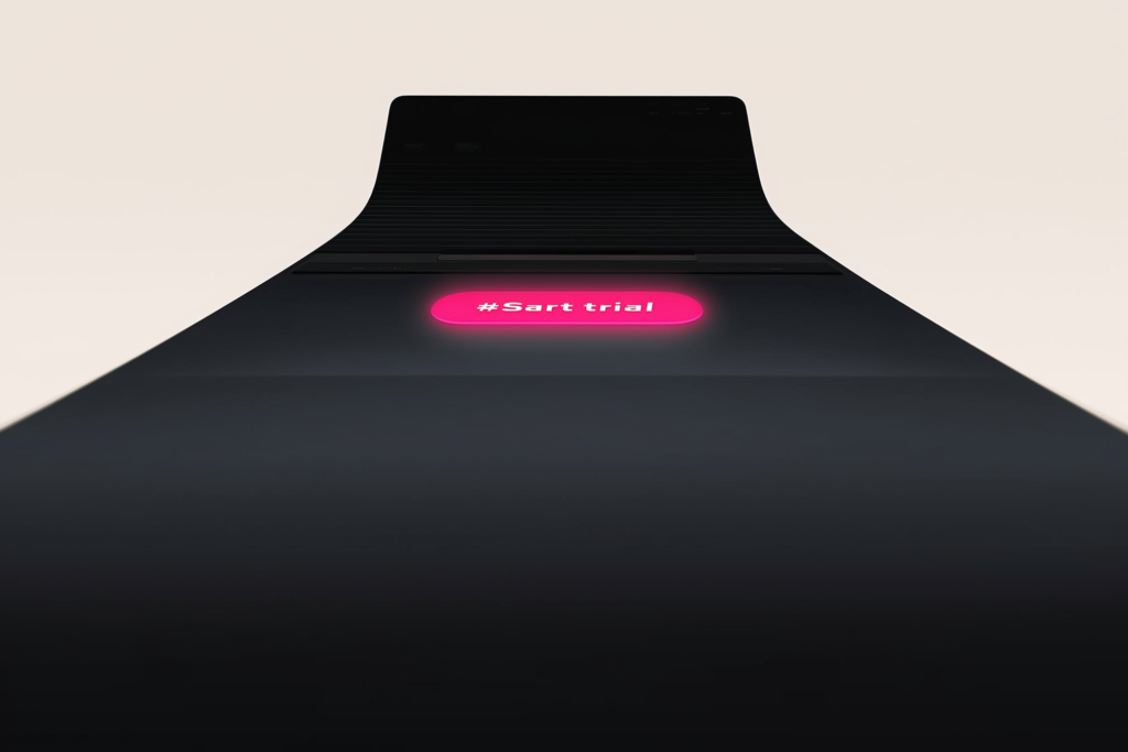
Match the signup path to your price and complexity. Free trial or freemium suits low-touch, self-serve products a user can experience alone. ‘Book a demo’ suits higher-priced, complex or enterprise tools that need a human to show value. Many SaaS brands offer both — self-serve for SMBs, demo for enterprise — and let the buyer choose.
Whatever the path, the enemy is friction. For trials and freemium, ask for the minimum — ideally just an email, or social/Google sign-in — and never demand a credit card before the user has felt any value; that single field tanks signups. Get them to their first ‘aha’ moment fast, because activation, not signup, is what predicts a paying customer. For demo flows, keep the form short (name, work email, company), set expectations on what happens next, and offer instant scheduling instead of ‘we’ll get back to you’ — speed-to-lead wins B2B. The mistake is forcing everyone down one path: gating a simple ₹499/month tool behind a sales call, or pushing a complex enterprise platform into a self-serve trial nobody can figure out. Pick the path your buyer actually wants, then strip every needless step out of it. This is the same conversion-rate discipline behind any high-performing landing-page CRO — less friction, faster value, one clear next step.
How much do speed, proof and trust affect SaaS conversion?
Enormously. A slow site loses signups before the pitch lands, weak proof leaves buyers unconvinced, and missing trust signals stall enterprise deals. Speed, social proof and credibility aren’t polish — they’re core conversion levers, and on SaaS sites they’re the ones most often neglected in favour of a flashier hero.
On speed: Google reports that bounce probability rises sharply as load time grows from one to several seconds, and a heavy SaaS hero packed with animation is a common culprit. Hitting strong Core Web Vitals — fast load, quick interactivity, stable layout — isn’t just an SEO checkbox; it directly protects your conversion rate, and it matters even more on India’s mixed mobile networks. On proof: layer it. Recognisable customer logos, specific outcome stats (‘cut onboarding time 60%’), real testimonials with names and faces, and full case studies each de-risk the decision at a different depth. On trust: as you move up-market, surface security and compliance (data handling, SOC 2 or ISO if you have it, uptime). A buyer evaluating a tool to run their business is really asking ‘can I rely on these people?’ — speed, proof and trust are how the site answers yes.
| Element | What ‘good’ looks like | What it costs you if weak |
|---|---|---|
| Hero clarity | What / who / why-you understood in 5 seconds | Instant bounce — the funnel never starts |
| Messaging | Outcomes & jobs-to-be-done, not feature lists | Visitors don’t see themselves; they leave |
| Pricing page | Clear tiers, one recommended, no hidden cost | High-intent buyers stall and abandon |
| Signup path | Minimal friction, matched to product complexity | Drop-off at the last, most valuable step |
| Speed / Core Web Vitals | Fast load, stable layout, mobile-first | Lost signups before the pitch even loads |
| Proof & trust | Logos, outcome stats, case studies, security | Doubt wins; the deal quietly dies |
How do you build a SaaS website for both SEO and measurement?
Build it so search engines can read it and so you can see what converts. That means a crawlable structure (real pages for use-cases, comparisons and a blog — not everything trapped behind a login or a single JavaScript bundle), fast technical performance, and event-based analytics that track signups and activations, not just pageviews.
On the SEO side, a SaaS site should earn organic pipeline, not just hold a logo. Give each high-intent topic its own indexable page — use-case, integration, comparison and ‘[competitor] alternative’ pages all rank for buyers in evaluation mode — and make sure they’re server-rendered or pre-rendered so they actually get crawled. Keep URLs clean, headings structured, and the blog mapped to the questions buyers ask. On measurement, vanity metrics are a trap: track the events that matter — trial starts, demo requests, activation milestones, plan selected — and tie them to source so you know which page and channel produce real customers, not just traffic. Instrument the funnel from first visit to first value, then improve the worst-converting step. A SaaS website is never ‘done’; it’s a system you read and tune, which is why owned demand from search plus honest analytics beats pouring more ad spend onto a leaky page.
The bottom line
A SaaS website that converts isn’t the prettiest one — it’s the clearest. It tells the right visitor, in five seconds, what they get and why it’s for them; it routes them through pages built around their job; it makes pricing obvious and signup frictionless; and it loads fast and proves it can be trusted. Strip the brochure instinct, design backwards from the trial or demo, and instrument what actually converts. Do that, and your site stops being a digital business card and starts being your most reliable salesperson — one that works at 2am, in any city, for any buyer who lands on it.
Frequently asked questions
Clarity in the hero. Within five seconds a visitor must understand what the product does, who it’s for, and why it beats the alternative — through an outcome-led headline, a one-line subhead naming the buyer, a real product visual, and one primary CTA. Everything else matters less than getting those five seconds right, because a confused visitor bounces before any feature can persuade them.
Match it to price and complexity. Low-touch, self-serve products that a user can experience alone suit a free trial or freemium tier. Higher-priced, complex or enterprise tools that need a human to show value suit ‘Book a demo’. Many SaaS brands offer both — self-serve for SMBs, demo for enterprise — and let buyers choose the path that fits how they want to evaluate.
Make the right plan obvious. Show three or four clear tiers, highlight one as recommended, frame each by the outcome it unlocks rather than a long feature matrix, and remove fear with a free trial, cancel-anytime and a money-back line. Show prices in ₹ with GST clarity for India and USD for global, and always give enterprise a ‘Contact us’ option. Confusion costs more revenue than price does.
Usually no. Requiring a credit card upfront sharply reduces signups, because it adds risk and friction before the user has felt any value. Ask for the minimum — ideally just an email or a Google or social sign-in — get them to their first ‘aha’ moment fast, and convert them to paid once they’ve experienced the product. Activation, not signup, is what predicts a paying customer.
Yes, directly. Google reports bounce probability climbs sharply as load time grows from one to several seconds, and a slow, animation-heavy SaaS hero loses visitors before your value proposition even appears. Strong Core Web Vitals — fast load, quick interactivity, stable layout — protect conversions as much as rankings, and they matter even more on India’s mixed mobile networks where many of your buyers arrive.
At minimum: a clear homepage, product or use-case pages framed by persona, a strong pricing page, comparison and ‘[competitor] alternative’ pages to capture buyers in evaluation, and customer case studies for proof. Add a docs or help section (it ranks and reassures) and a security or trust page once you sell to mid-market and enterprise. Skip low-converting filler like a standalone ‘our values’ page.