On this page
Key takeaways
- Packaging is the only ad that travels home with the customer — it has to win the shelf in three seconds, then earn the repost on the kitchen counter.
- On Amazon and Blinkit your pack competes as a thumbnail first; if the name and product aren’t legible at 200 pixels, great design on the physical box is wasted.
- Good design and legal compliance are not a trade-off. FSSAI and Legal Metrology declarations are non-negotiable — the craft is fitting them in without making the pack look like a government form.
Your packaging is doing a job whether you designed it on purpose or not. On a crowded Indian shelf — or a Blinkit grid that loads in under ten seconds — it is the single asset deciding whether a stranger picks you up or scrolls past. Here’s how packaging design actually sells in India: the hierarchy that wins in three seconds, the regulatory must-haves you cannot skip, what it really costs, and the mistakes that make a good product look cheap.
Why does packaging matter so much, and what should it actually do?
Because packaging is the only piece of marketing that travels home with the customer and keeps selling after the sale. It has four jobs, in order: stop the customer, communicate what it is, justify the price, and earn a repost. Get noticed in three seconds, answer ‘is this for me?’ instantly, look worth the MRP, and be photographable.
Think about where Indian buying decisions actually happen now. In a Reliance Smart or a local kirana, a shopper scans a shelf in seconds and a pack either stops the eye or disappears. On D2C marketing surfaces — Amazon, your own site, a quick-commerce app — the same pack is fighting as a thumbnail against fifty others. And for a D2C brand, the parcel that lands at the door is a moment the customer films and posts, or quietly bins. That is three different jobs — shelf, screen, doorstep — and weak packaging fails at all three at once.
Most Indian packs over-invest in communication and ignore the rest. They cram every feature, certification and flavour note onto the front — and end up saying nothing because everything shouts at once. A pack that does its job is ruthless about hierarchy: the shelf-stop is usually colour and form; the communication is the product name and category; the price justification is material quality, finish and restraint; and the repost is the small surprise — a line of copy, an illustration, an unboxing detail — that makes someone show a friend. Strong packaging is not decoration on top of the product; it is the product’s argument for why it deserves the price on the sticker. Get the order right and a modest budget outperforms an expensive pack that tried to say everything.
What visual hierarchy makes packaging sell in three seconds?
A pack that sells follows a strict reading order: first the brand and what the product is, second the variant or key benefit, third the proof and detail. A shopper’s eye should land, understand, and decide before conscious thought kicks in. If they have to hunt for what it is, you have already lost the three seconds you had.
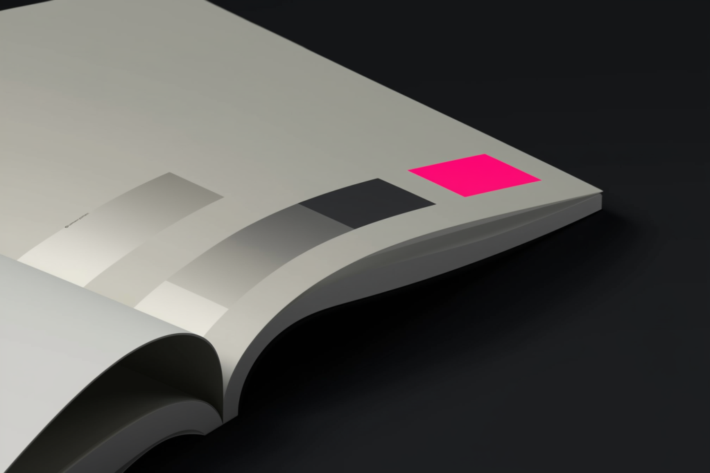
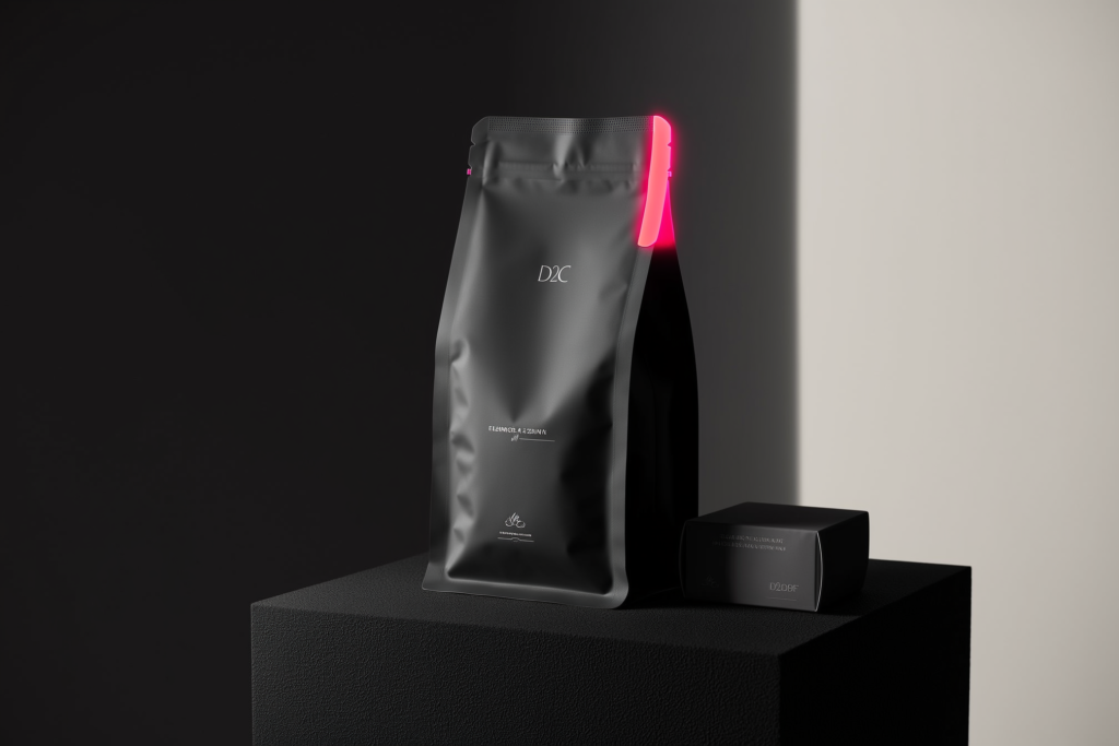
Build the hierarchy in three tiers and protect it like a budget. Tier one — the things visible from a metre away on a shelf or as a small thumbnail: the brand mark, the product category in plain words (‘Cold Brew’, ‘Atta’, ‘Face Serum’), and the single strongest colour or visual cue. Tier two — read at arm’s length once you’ve been stopped: the variant, flavour or the one benefit that matters most. Tier three — read in hand, when the customer is already interested: net quantity, ingredients, the story, certifications, usage. The classic mistake is treating all three tiers as equally important, so the front becomes noise. When we worked on the visual identity and product design for Toffee Coffee Roasters, a funded D2C coffee startup, the discipline was exactly this — deciding what a coffee buyer needed to read first on a pouch, and being willing to make everything else quieter so that one thing could win.
How is designing for the digital shelf different from the physical shelf?
On a physical shelf the customer holds the pack, turns it, reads the back. On the digital shelf — Amazon, Flipkart, Blinkit, Zepto — they see one small image and a price and decide in a swipe. The pack must work as a thumbnail first and an object second. Legibility at small sizes beats fine detail every time.
Two practical consequences follow. First, the front of the pack has to survive being shrunk to the size of a thumbnail: the brand and the product type must stay readable at roughly 200 pixels, which kills thin fonts, low-contrast colour pairings and busy backgrounds. Second, quick-commerce changes the photography game — on a Blinkit or Instamart grid your pack sits next to a giant national brand, so a clean silhouette and a high-contrast front read better than an intricate illustration that turns to mush. Design the physical pack and the e-commerce hero image as one system, not as an afterthought where someone photographs the box on a white background the night before listing. The brands that win the Indian digital shelf design backwards from the thumbnail, then make sure the real object lives up to it in the hand.
What does the unboxing moment do for a D2C brand?
For a D2C brand, unboxing is a marketing channel disguised as logistics. The parcel is the only physical touchpoint many customers get, and a considered open — a branded mailer, a thank-you card, a product that emerges well — turns a one-time buyer into a repeat order and a post. Done badly, it just says ‘you overpaid.’
You do not need to spend heavily to do this well; you need to spend deliberately. A printed inner, a sticker that seals the tissue, one honest line of copy on the flap, packaging that protects the product so it never arrives dented — these cost little and read as care. The reflex to avoid is over-engineering: layers of plastic, a box four sizes too big, filler that spills everywhere. Indian D2C customers, especially the ones who post, increasingly read excess packaging as wasteful rather than premium. The goal is a moment worth filming that also respects the customer’s time and the planet — thoughtful, not theatrical. The brands that get repeat purchase treat the unboxing as the first chapter of the next sale, not the end of the last one.
What are the legal must-haves on Indian packaging (FSSAI, Legal Metrology)?
Indian packaging carries non-negotiable declarations, and design must make room from the start. For food, FSSAI rules require the product name, the full ingredient list in descending order, nutritional information, allergen and additive declarations, the FSSAI licence number and manufacturer details. Legal Metrology mandates net quantity, MRP (inclusive of all taxes), and the manufacturing or packing date.
A few more that catch first-time founders out. Food packs must carry the veg/non-veg mark — the green or brown dot in its prescribed box — positioned correctly near the name. Country of origin matters for imported goods, and consumer-complaint or customer-care details are expected. For e-commerce, the mandatory information has to reach the buyer before purchase, so your listing has to surface it too, not just the physical label. There is also a useful design relief: where a pack’s total surface area is very small (the rule sits around 100 square centimetres), some declarations like the full ingredient list and nutritional panel are relaxed — which matters when you design sachets or sample sizes. Treat all of this as a design constraint, not paperwork bolted on at the end. None of this is legal advice — confirm the current requirements with a compliance expert — but the principle holds: bake the mandatory panel into the layout on day one, so it reads cleanly instead of looking like a form stapled to a beautiful front.
How much does packaging design cost in India?
Packaging design in India typically costs from ₹8,000 for a single freelance label to ₹6 lakh and beyond for a full D2C system with strategy and a range of SKUs. A single primary pack from a studio commonly lands at ₹40,000–1.5 lakh; a small multi-SKU range with guidelines runs ₹1.5–6 lakh. Print and material costs sit on top, separately.
The spread is about scope and thinking, not just how the artwork looks. A ₹8,000 label is one person adapting a template to your front; a ₹3 lakh engagement is a team deciding the hierarchy, the structure, the digital-shelf hero, the regulatory layout and a system that holds across flavours and pack sizes. Treat the table below as market-typical ranges across Indian freelancers, studios and agencies — not DESENO price tags — and remember it covers design only. Physical unit cost (substrate, printing, finishes, MOQs) is a separate line that scales with your material and volume choices.
| Tier | Typical ₹ range | What’s included | Best for |
|---|---|---|---|
| Freelance single label | ₹8,000 – 30,000 | One pack front/label, basic print-ready file | Testing a single SKU, first small batch |
| Studio single pack | ₹40,000 – 1.5 lakh | One primary pack designed properly, dieline, print-ready artwork, e-commerce hero image | A serious launch of one hero product |
| Multi-SKU range + system | ₹1.5 – 6 lakh | A pack system across SKUs, variant logic, unboxing, digital-shelf assets, packaging guidelines | Growing D2C/FMCG brands going to market across flavours and channels |
| Strategy-led packaging | ₹6 lakh+ | Category & shelf research, structure/material direction, naming support, full system and brand fit | Funded startups, premium launches, category challengers |
| Physical print & material | Separate, per unit | Substrate, printing, finishes, MOQs — scales with volume | Every brand — budget this alongside the design fee |
How do you balance sustainability, materials and cost?
Pick the material that protects the product, fits your budget at volume, and matches the promise on the front — in that order. Sustainability is increasingly expected by Indian D2C buyers, but greenwashing a flimsy pack that fails the product is worse than an honest one. The smartest move is right-sizing: less material, better chosen, beats a heavier ‘eco’ pack.
Material is where design meets economics, and the trade-offs are real. Recyclable mono-material pouches, kraft cartons and paper-based mailers read as responsible and often cost less than the over-built alternatives — but they have to actually keep coffee fresh or a serum stable, or you have saved money and lost a customer. Be careful with claims: vague ‘eco-friendly’ lines invite scepticism, while specifics (‘recyclable mono-material’, ‘FSC-certified board’) earn trust. And watch the hidden costs — a fancy finish or an unusual structure can blow your per-unit price or your minimum order quantity. The brands that get this right design the material decision in from the first sketch, so sustainability, protection and cost are solved together rather than bolted on after the artwork is approved.
What packaging mistakes make a good product look cheap?
The mistakes that cheapen a good product are nearly always self-inflicted: a cluttered front with no hierarchy, type too small to read as a thumbnail, low-contrast colours that vanish on a shelf, cheap finishes that fight a premium price, and a back panel where the mandatory text looks crammed in. None of these are about budget. They are about discipline.
A few more we see repeatedly across Indian brands. Designing only for the physical pack and ignoring how it looks as an Amazon or Blinkit thumbnail — so the listing image is weak even when the box is lovely. Inconsistency across SKUs, where each flavour feels like a different brand, so the range never builds recognition. Over-packaging that reads as wasteful instead of premium. Trend-chasing a look that dates in a year. And the quiet killer — treating regulatory text as an enemy of the design rather than part of it, then cramming it in badly at the end. Every one of these is fixable with a clear hierarchy, a consistent branding & positioning backbone, and the willingness to design for the thumbnail and the hand at once. Cheap-looking packaging is rarely a money problem; it is a decision problem.
Nobody decides to make their product look cheap. They just say yes to a busy front, a thin font and a back panel nobody planned — and the shelf does the rest. Packaging punishes indecision in public.— Murtaza Udaypurwala, DESENO
The bottom line
Packaging in India is not the wrapper around your product — it is the product’s argument, made in three seconds on a shelf, as a thumbnail on Blinkit, and on a doorstep worth filming. Get the hierarchy right, design for the digital shelf as deliberately as the physical one, treat FSSAI and Legal Metrology as constraints you build in from day one, and spend on the tier your stage actually needs. Do that and a modest budget can out-sell an expensive pack that tried to say everything. Skip it, and you will pay the cost where it hurts most — quietly, on the shelf, every single day.
Frequently asked questions
Packaging design in India typically costs ₹8,000–30,000 for a single freelance label and ₹40,000–1.5 lakh for one pack designed properly by a studio. A multi-SKU range with a system and guidelines runs ₹1.5–6 lakh, and strategy-led packaging starts around ₹6 lakh. These are design fees only — physical printing, material and minimum-order costs are a separate, per-unit line.
Food packaging in India must carry the product name, the ingredient list in descending order, nutritional information, allergen and additive declarations, the FSSAI licence number, manufacturer details, and the veg/non-veg mark under FSSAI rules. Legal Metrology adds net quantity, MRP inclusive of taxes, and the manufacturing or packing date. For e-commerce, this information must also reach the buyer before purchase. Always confirm current rules with a compliance expert.
Shelf stand-out comes from a clear visual hierarchy and a strong shelf-stop cue, not from cramming more on the front. The brand and what the product is should read instantly from a metre away, helped by one dominant colour or form and high contrast. Everything else — variant, benefit, proof — should sit in lower tiers, so the eye lands, understands and decides in about three seconds.
Design for the thumbnail first. On Amazon, Flipkart and quick-commerce apps like Blinkit and Zepto, customers see one small image, so the brand and product must stay legible at roughly 200 pixels — which rules out thin fonts, low contrast and busy backgrounds. Build the e-commerce hero image as part of the packaging system, use a clean high-contrast front, and test it inside a grid of competitor thumbnails before approving.
Not always. Right-sized, recyclable mono-material pouches, kraft cartons and paper mailers often cost less than over-built ‘premium’ packs while reading as responsible to Indian D2C buyers. The cost usually rises with special finishes, unusual structures or low volumes that push up your minimum order quantity. The key is to choose a material that genuinely protects the product and to make specific, honest claims rather than vague ‘eco-friendly’ lines.
Usually because of the packaging, not the product. A cluttered front with no hierarchy, type that is too small or thin, low-contrast colours, cheap finishes that clash with the price, and a messy regulatory panel all signal ‘cheap’ before the customer ever tries what is inside. Inconsistency across flavours and a weak e-commerce thumbnail make it worse. These are design-discipline problems, and they are fixable without a bigger budget.